DUKE - Crest, Laurel and the Quiet Order of Heraldry
Pairs well with
Here's the one we'd pick next.
Deliver to United States
Standard - Order today to get by Oct. 21 - Oct. 30
Transparent Policies. Worry-Free Shopping.
Read our Shipping Policy and Returns & Refunds before placing your order
Some designs argue. This one simply holds its ground. A heraldic composition, centred and still, built on the oldest visual language there is: the crest.
Design Story
The wrap is organised in horizontal bands. Cream fields carry the weight of the type, deep navy anchors the base, and a thin gold line separates one register from the next. At the centre sits a shield with the Blue Devil profile, framed by laurel and scrollwork that curves outward without ever crowding it. Below, banner panels read DUKE BLUE DEVILS, EST. 1838, LIMITED EDITION, each one smaller than the last, so the eye descends in a measured sequence rather than scattering. The mascot's expression is composed, almost amused. Nothing lunges. The tension lives instead in the contrast between ornate gold filigree and the flat, uninterrupted navy beneath it.
Use & Experience
On a vertical tumbler silhouette, this hierarchy works in your favour. The crest reads as the front-facing focal panel at eye level, while the darker lower third gives the composition a base and lets the ornament breathe. The handle frames the artwork rather than competing with it, keeping carry presence formal and quiet.
Size & Capacity
Available capacity: 40 oz.
A crest, read one band at a time — restraint dressed in gold.
Frequently Bought Together

DUKE - Crest, Laurel and the Quiet Order of Heraldry
The story
The story behind this design
Questions, answered
What sizes does this jersey come in?
Can I add a name and number?
How long does shipping take?
What if the size doesn't fit?
How do I care for my jersey?
Will the colors and logos match the photos?
More designs
Tap a design to add it in your size. No need to leave the page.
Choose Options

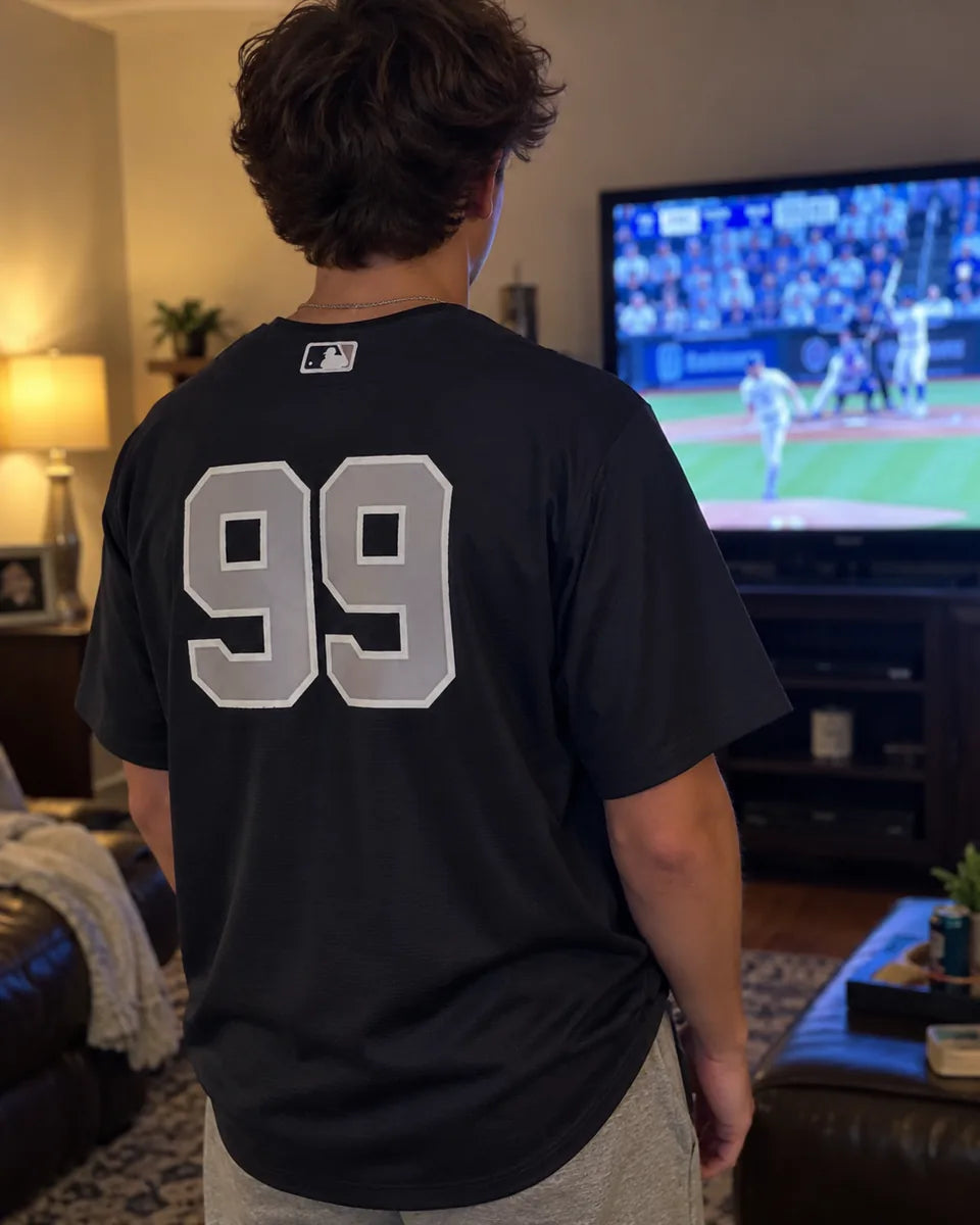
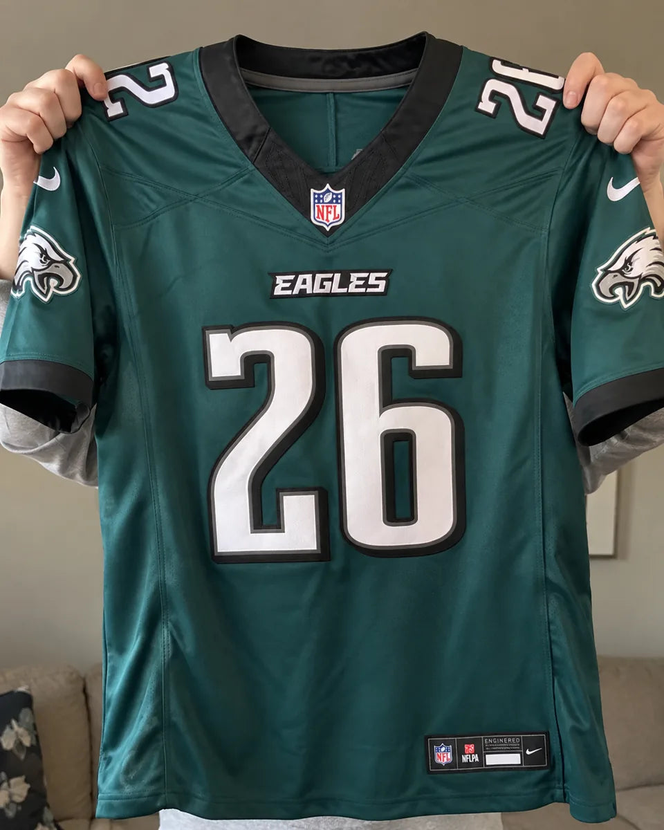
Seen on Game Day
How fans wear this team's jerseys.